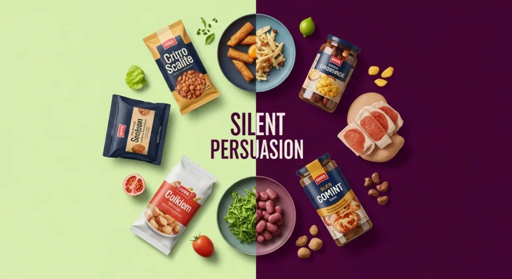
The Grocery Store Decision That Feels So Logical
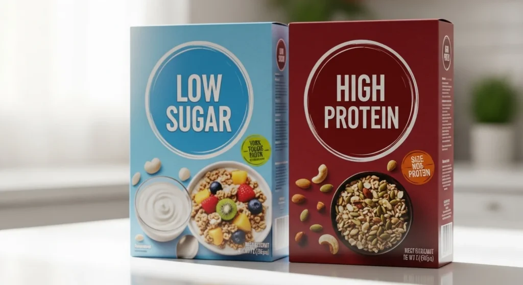
You’re standing in the aisle holding two boxes.
One has less sugar.
The other has more protein.
You do what every responsible person would do:
You compare the labels.
You calculate the grams.
You choose the “better” one.
And you walk away feeling relieved.
Like you just made a smart, healthy decision.
But here’s the surprising truth:
Comparing labels often gives the illusion of control — not actual clarity.
Because food doesn’t work like a spreadsheet.
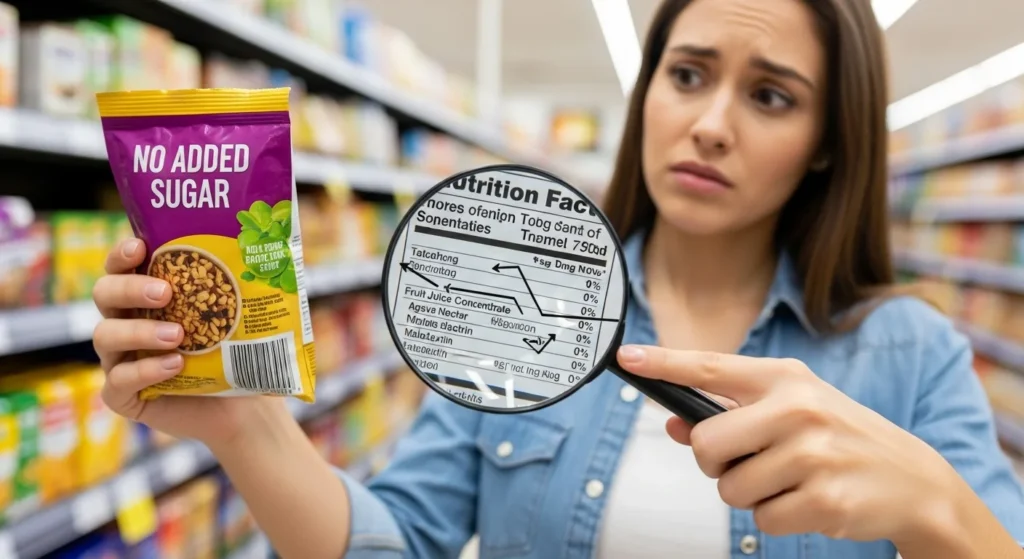
And nutrition labels rarely tell the full story.
The Big Assumption: “Lower Numbers Mean Better Health”
Most people have been trained to believe:
- Less sugar = healthier
- Less fat = safer
- More protein = smarter
- More fiber = better
So comparing labels feels responsible.
But nutrition is not only about numbers.
It’s about:
- Food quality
- Processing
- Structure
- Ingredients
- How your body responds
Two products can look different on paper…
And affect your body in almost identical ways.
That’s why label comparison can be misleading.
Why Labels Are Incomplete by Design
Food labels were created for transparency…
But they’re also shaped by regulation and marketing.
Labels can tell you:
✅ Macronutrients
✅ Calories
✅ Some vitamins
✅ Serving sizes
But they rarely show:
- Processing level
- Additives impact
- Food structure
- Satiety effect
- Long-term eating behavior
A label is a snapshot.
Not the full film.
And when you compare two snapshots, you may miss the bigger truth.
The Serving Size Trick: The Comparison That Isn’t Real
One of the most common ways label comparisons break down is serving size.
Example:
- Snack A shows 90 calories
- Snack B shows 130 calories
But Snack A’s serving is half the amount.
So you think you’re choosing the lighter option…
When you’re just comparing different math.
This is why serving size manipulation matters.
Always ask:
Would I actually eat only this amount?
If not, the comparison is misleading from the start.
Real-Life Example: Two “Healthy” Cereals
Let’s say you compare:
Cereal 1: Lower sugar
Cereal 2: Higher fiber
They look different.
But both are:
- Highly refined grains
- Fast-digesting
- Lightly filling
- Easy to overeat
The differences are marginal.
The shared reality is bigger:
Both are ultra-processed breakfast products.
The label comparison focuses your attention on small differences…
While hiding the larger similarity.
The Health Halo Effect: Why Labels Feel More Meaningful Than They Are
Behavioral research shows that health claims create a psychological shortcut called:
The Health Halo Effect
One “good” number makes the entire product feel healthy.
Examples:
- “Only 2g sugar” makes it feel clean
- “20g protein” makes it feel powerful
- “Gluten-free” makes it feel safer
So when you compare products, you’re not just comparing food…
You’re comparing emotional signals.
That’s why label shopping often leads to false confidence.
Why This Matters Today: Ultra-Processed Foods Win the Label Game
Most products in modern grocery stores are engineered.
And ultra-processed foods are especially good at:
- Optimizing nutrition panels
- Adding isolated nutrients
- Reducing one “bad” ingredient
- Highlighting one “good” claim
So two highly processed foods can compete like this:
- One reduces sugar
- One boosts protein
- One adds fiber
But both still share the same core problem:
They are structurally broken foods designed for overconsumption.
Labels can’t show that.
Comparison Table: Label Differences vs Real Differences
| Label Comparison Focus | What Shoppers Think | What Might Be True Instead | Better Question to Ask |
|---|---|---|---|
| Lower Sugar vs Higher Sugar | Lower is healthier | Artificial sweeteners may replace it | What’s the ingredient quality? |
| More Protein | More filling | Processed isolates digest fast | Is protein coming from real food? |
| Less Fat | Better for weight | May increase carbs and hunger rebound | Does it satisfy naturally? |
| Added Fiber | Gut-friendly | Fiber powder isn’t intact plant fiber | Is the food structurally whole? |
| Fewer Calories | Better choice | Serving size games distort reality | How much would I actually eat? |
The Ingredient List Tells a Different Story
Two labels might look different…
But the ingredient list often reveals the truth.
If both products contain:
- Modified starch
- Maltodextrin
- Seed oils
- Natural flavors
- Emulsifiers
- Sweeteners
They may be nutritionally similar in impact…
Even if the front numbers look different.
The ingredient list is the part most shoppers ignore.
And it’s usually the most honest.
Hidden Tip: When Label Comparison Actually Helps
Label comparison isn’t useless.
It’s just incomplete.
It helps most when comparing:
✅ Similar whole foods
Examples:
- Plain yogurt vs flavored yogurt
- Peanut butter brands
- Bread with minimal ingredients
- Frozen vegetables with sauces
It helps less when comparing:
❌ Ultra-processed “health” products
Protein bars vs protein bars isn’t real nutrition.
It’s marketing vs marketing.
Common Mistakes People Make When Comparing Labels
Here are the traps even smart shoppers fall into:
1. Comparing nutrients, not food form
Processed is processed, even with better numbers.
2. Ignoring the ingredient swaps
Less sugar often means more sweetener.
3. Falling for “better of two bad options”
The healthier cookie is still a cookie.
4. Treating label shopping as control
Real health comes from patterns, not packaging.
5. Forgetting satisfaction matters
Foods that don’t satisfy lead to more snacking.
Actionable Steps: How to Make Smarter Choices Without Overthinking
Here’s a practical grocery strategy that actually works.
The 5-Step Label Reality Check
- Compare food types first
Whole foods beat packaged comparisons. - Check serving sizes
Normalize the portion mentally. - Read ingredients before nutrients
Ingredients show processing. - Look for intact structure
Nuts, oats, beans, real food sources. - Ask: Would this exist in a kitchen?
If not, be cautious.
Simple beats perfect.
Real-Life Example: Yogurt Done Right
Compare these:
Yogurt A:
- Sweetened
- Artificial flavors
- Added stabilizers
- 12g sugar
Yogurt B:
- Plain yogurt
- Fruit added at home
- Natural satiety
- Simple ingredients
The label comparison might show small differences.
The real difference is food form.
The best nutrition isn’t found in the better label…
It’s found in the simpler food.
Key Takeaways
- Comparing labels often creates a false sense of clarity
- Nutrition panels don’t show processing, structure, or satiety
- Serving sizes distort comparisons
- Ultra-processed foods are designed to win on label metrics
- Ingredient lists matter more than minor nutrient differences
- The healthiest choice is often the least engineered one
FAQ: Common Questions People Ask
1. Is comparing nutrition labels always bad?
No, it can help with similar foods, but it’s misleading when comparing ultra-processed products.
2. What matters more than calories or macros?
Ingredient quality, food structure, and how satisfying the food is long-term.
3. Why do packaged foods look healthy on paper?
Because companies optimize labels with isolates, additives, and strategic serving sizes.
4. Should I ignore nutrition facts completely?
No, but treat them as one piece of the picture, not the entire story.
5. What’s the simplest way to shop smarter?
Prioritize whole foods and use labels mainly to compare minimally processed options.
Clean Conclusion: Labels Compare Numbers, Not Nourishment
Comparing labels feels like being responsible.
It feels like control.
But nutrition is bigger than grams and percentages.
Two foods can look very different on a panel…
And behave very similarly in the body.
Real clarity doesn’t come from choosing the best-looking box.
It comes from choosing foods that don’t need to compete on packaging at all.
Less marketing.
More real food.
That’s the comparison that actually matters.