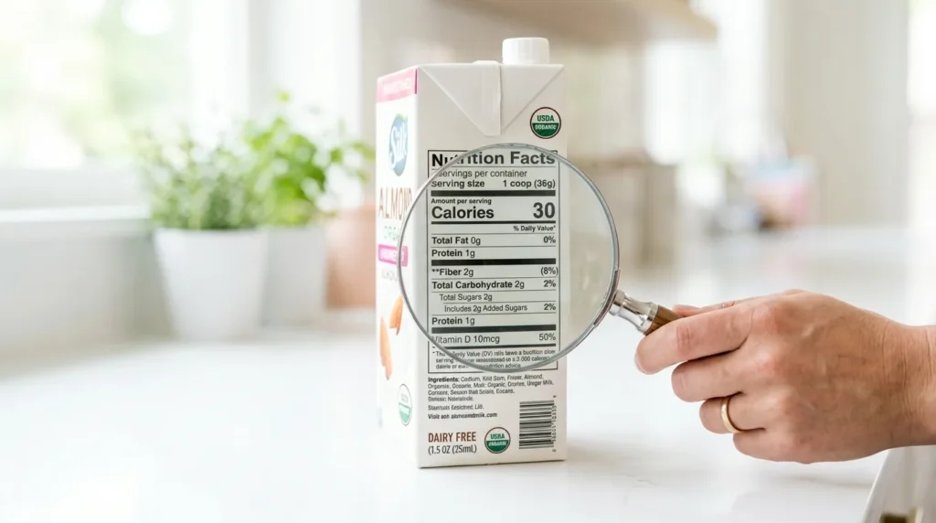
Behind every number on a nutrition label sits a genuinely enormous amount of science — population studies, metabolic research, government committees debating exact thresholds for years. You’ll never see any of that standing in a grocery aisle with fifteen seconds to decide between two cereal boxes. And that’s precisely the point. The nutrition label isn’t really a science document. It’s a translation layer, built specifically to compress decades of nutrition research into something you can process in a glance.
Understanding how that translation actually works — and where something inevitably gets lost — makes you a sharper reader of every label you’ll ever look at.
The Number Designed to Do the Hardest Job on the Label
Look at any nutrition panel and the column doing the heaviest lifting is the one you probably think about least: percent Daily Value, or %DV. It exists because of a very specific problem regulators had to solve. A gram of sodium and a gram of vitamin C are meaningless compared to each other in raw units — there’s no intuitive way to know if either amount is a lot or a little just by looking at the number. The %DV was built to solve exactly that, converting every nutrient into the same universal currency: what percentage of a full day’s worth does this serving represent.
This wasn’t a casual design choice. Federal guidance establishing nutrition labeling specifically required the panel to let people “readily observe and comprehend” nutrition information and understand its relative significance in the context of an entire day’s diet — and %DV was the FDA’s direct answer to that legal mandate. Underneath it sits its own quiet piece of scientific compromise: the reference values were deliberately built around estimated average requirements for a population, not individualized targets, because a label has to work for millions of different bodies with one shared set of numbers. The FDA’s own guidance distills this into a simple rule of thumb: 5% DV or less counts as low, 20% DV or more counts as high — a two-number heuristic standing in for a mountain of underlying nutrition science most shoppers will never read.
The Fine Print Doing Its Own Translation Work
Even the label’s most misunderstood number — the famous 2,000-calorie reference — is a translation, not a personal prescription. It was chosen as a workable average across an adult population with wildly different actual calorie needs by age, sex, and activity level, specifically so the %DV column would have one consistent denominator to work from. The label carries a small footnote acknowledging exactly this, but the footnote routinely gets skipped, and the number quietly gets treated as a personal target it was never designed to be. That’s a useful reminder about labels in general: the simplification is intentional and functional, but it always assumes an “average” that doesn’t perfectly describe any one real person.
When Governments Simplify Even Further
The U.S. panel is a relatively information-dense format — it still asks you to read multiple numbers and do some comparison yourself. Several other countries have pushed the translation a layer further, compressing an entire nutrient profile into a single glanceable symbol. France’s Nutri-Score reduces a food’s overall nutritional quality to one letter, A through E, color-coded from green to red, calculated by an algorithm weighing beneficial and detrimental nutrients against each other. The UK’s Multiple Traffic Light system takes a different approach, color-coding several nutrients individually rather than combining them into one score.
Researchers have directly tested whether this extra layer of simplification actually helps. A randomized controlled trial comparing the Multiple Traffic Light and Nutri-Score formats against no label at all found that both meaningfully improved the nutritional quality of what people purchased in a simulated grocery store — evidence that a well-designed simplification can genuinely change behavior, not just perception. Separate research comparing understanding across label formats found that single-score, color-coded systems like Nutri-Score tend to produce more accurate identification of the healthier option than displaying raw numerical information alone, particularly among consumers with less nutrition background — suggesting the simpler the translation, the wider the group of people it actually reaches.
What Gets Lost Every Time Science Gets Compressed
Every act of simplification necessarily leaves something out, and nutrition labels are no exception. A single Nutri-Score letter can’t capture how processed an ingredient is, or how a nutrient behaves differently depending on what food carries it. Its own scientific documentation is explicit that the score is meant for comparing similar products within a category, not for making broad statements about someone’s overall diet. The %DV system, similarly, tells you a great deal about quantity and comparatively little about food quality, ingredient source, or how a food behaves as part of a real eating pattern over time. Simplification is the entire value of a label — and also, unavoidably, its limitation.
Why This Design Actually Works in Your Favor
None of this is a case against nutrition labels — quite the opposite. The alternative to a well-designed simplification isn’t perfect, unfiltered scientific understanding; it’s most people making decisions with no usable information at all, because raw nutrition science isn’t something you can reasonably process while standing in a cereal aisle. A good label is a compression algorithm for expertise: it hands you the output of research you’ll never personally have time to read, in a format built specifically for a fifteen-second decision.
The smartest way to use one isn’t to distrust the simplification — it’s to understand what it was built to answer, use it for exactly that, and know where its edges are. That’s not a flaw in the system. That’s what a good translation is supposed to do.
Sources
- NIH/NCBI — Guiding Principles for Selecting Reference Values for Nutrition Labeling (Dietary Reference Intakes)
- U.S. FDA — How to Understand and Use the Nutrition Facts Label
- NIH Office of Dietary Supplements — Daily Values (DVs)
- NIH/NCBI — Randomized Controlled Trial Evaluating the Relative Effectiveness of the Multiple Traffic Light and Nutri-Score Front-of-Package Labels
- NIH/NCBI — Objective Understanding of the Nutri-Score Front-of-Pack Label by European Consumers

Aarti Solanki, B.Sc. (Food Science), is a food science writer passionate about making nutrition simple and evidence-based. She creates well-researched, easy-to-understand articles on healthy eating, food science, and nutrition, using information from trusted scientific and public health sources.

Pingback: What Food Labels Are Really Designed to Do — And the Truth They Never Promise You
Pingback: How Food Labels Use Familiar Words Strategically — And Why They Instantly Feel Safer Than They Are
Pingback: How Food Labels Downplay Processing — And Why “Healthy-Looking” Foods Aren’t Always What They Seem
Pingback: Why Percent Daily Values Cause Confusion — The Nutrition Numbers That Feel Helpful but Often Mislead
Pingback: Why Ingredient Order Matters More Than Buzzwords — And How to See Past Food Label Hype
Pingback: Why Nutrition Labels Were Created — And How They Quietly Shape Your Choices