
That familiar black-and-white box on the back of every package feels like it’s always existed. It hasn’t. The Nutrition Facts label is younger than the Simpsons, and it was born out of a very specific, very messy fight over what food companies were allowed to say about their products. Understanding why it exists reveals just how much its design still quietly steers your decisions today.
Before the Label, There Were Almost No Rules
For most of the 20th century, packaged food required very little nutrition disclosure at all. Provisions in the Food, Drug, and Cosmetic Act of 1938 regulated food labeling broadly, but mandatory nutrition information was limited to products making a specific nutrition claim or those fortified with vitamins, minerals, or protein. In practice, this meant a shopper could stand in front of two products and have no standardized way to compare what was actually inside either one.
Consumer Advocates Forced the Issue
The push for real nutrition labeling gained momentum through the 1980s, as advocacy groups like the Center for Science in the Public Interest began filing complaints and petitions over what they saw as a growing pattern of deceptive health and nutrition claims on packaging. Public concern about sodium, sugar, and fat was rising at the same time, and by 1989 the FDA announced it would revise food labeling and hold public forums to gather input on what a standardized label should include.
The Law That Changed Everything
In November 1990, the Nutrition Labeling and Education Act, or NLEA, was signed into law. It gave the FDA explicit authority to require standardized nutrition labeling on nearly all packaged foods and specified exactly which nutrients had to appear — calories, fat, saturated fat, cholesterol, sodium, carbohydrates, fiber, sugars, and protein, along with select vitamins and minerals. The law also required that this information be presented in the context of a full daily diet, which is where the now-familiar Percent Daily Value column originated. The Nutrition Facts panel most people recognize today first began appearing on packages in 1994.
Then-FDA Commissioner David Kessler summarized the goal plainly: the label was meant to help people make more informed, healthier choices — not just to provide raw data, but to make that data usable in the middle of a fast grocery trip.
It Was Designed to Change, Not Stay Fixed
According to FDA historians, the Nutrition Facts graphic was intentionally built to be flexible rather than permanent, meant to evolve alongside new nutritional science and shifting public concerns rather than remain frozen in its 1990s form. That flexibility is exactly what led to the label’s most significant redesign in 2016, when the FDA updated serving sizes, added a line specifically for added sugars, and adjusted formatting based on decades of research into how people actually read — or fail to read — the original version.
Reading the Label Doesn’t Automatically Mean Eating Better
Here’s the twist researchers eventually uncovered: introducing the label was not, by itself, enough to improve how people ate. One analysis tracking diet quality before and after NLEA implementation found that simply having the law in place did not measurably improve diet quality — but people who actually used the label consistently did show different outcomes than those who ignored it. In other words, the label’s power was never automatic. It only worked as a tool for the people who engaged with it.
Where Your Eyes Go Determines What You Notice
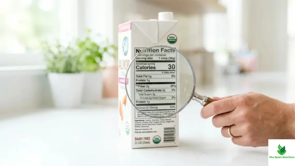
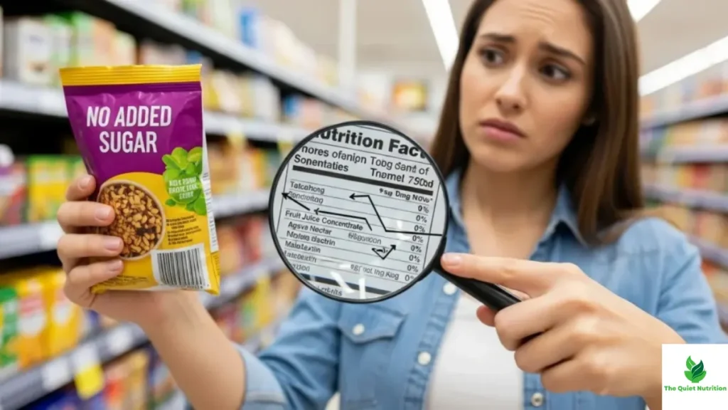
This is where label design quietly starts shaping behavior. Eye-tracking research has consistently found that consumers don’t read nutrition labels evenly — they tend to fixate on whatever appears at the top of the panel and skim or skip the rest. This is part of why some researchers have recommended relocating key nutrients like sugar to a more prominent position, since people are simply more likely to notice information placed higher on the label regardless of how important the information below it might be.
Attention also isn’t equal across shoppers. People motivated primarily by health concerns tend to look at nutrition information longer and more frequently than people shopping primarily based on taste, and consumers generally pay closer attention to labels when a product’s healthfulness feels uncertain — meaning an already “healthy-seeming” product may get less scrutiny simply because it doesn’t trigger the same instinct to check.
Serving Size Is One of the Most Misunderstood Parts of the Label
Research reviewing how people interpret serving size information found a persistent and important misunderstanding: many consumers interpret the labeled serving size as a recommended amount to eat, rather than what it actually is — a reference unit set by manufacturers or regulators for comparison purposes. This confusion has real consequences. Several studies found that larger labeled serving sizes led people to select larger self-chosen portions, suggesting that a number meant to standardize comparison can end up subtly recalibrating how much people think is “normal” to eat.
Better Design Improves Attention, Not Always Behavior
A review of eye-tracking studies on updated nutrition label designs found something worth sitting with: newer, more attention-grabbing label formats do successfully improve how much people notice and understand the information — but that increased attention doesn’t automatically translate into healthier food choices. People can look longer at a label, absorb more of what it says, and still choose the same product they would have chosen without reading it at all.
The Bottom Line
Nutrition labels exist because, for decades, there was no reliable way to know what you were actually eating — and it took consumer advocacy, government hearings, and a landmark 1990 law to change that. But the label was never a neutral, passive source of information. Its layout, its placement on the package, and even the psychology of where your eyes naturally land all quietly influence what you notice and what you skip. Knowing the label’s history is useful. Knowing that its design still shapes your attention today is what actually helps you use it well.
Sources
- International Food Information Council – The Nutrition Facts Label: Its History, Purpose and Updates
- Food Dive – The Origins and Evolution of Nutrition Facts Labeling
- NCBI Bookshelf – History of Nutrition Labeling (Front-of-Package Nutrition Rating Systems and Symbols)
- PMC (NIH) – A Review of Nutrition Labeling and Food Choice in the United States
- PMC (NIH) – Consumer Understanding, Perception and Interpretation of Serving Size Information on Food Labels
- ScienceDirect – Eye Tracking and Nutrition Label Use: A Review of the Literature and Recommendations for Label Enhancement

Aarti Solanki, B.Sc. (Food Science), is a food science writer passionate about making nutrition simple and evidence-based. She creates well-researched, easy-to-understand articles on healthy eating, food science, and nutrition, using information from trusted scientific and public health sources.


Pingback: What Nutrition Labels Leave Out: The Missing Context Behind “Healthy” Foods
Pingback: How “Healthy” Food Claims Quietly Lead to Overeating
Pingback: How Packaging Creates the Illusion of “Clean Ingredients” Without Full Disclosure