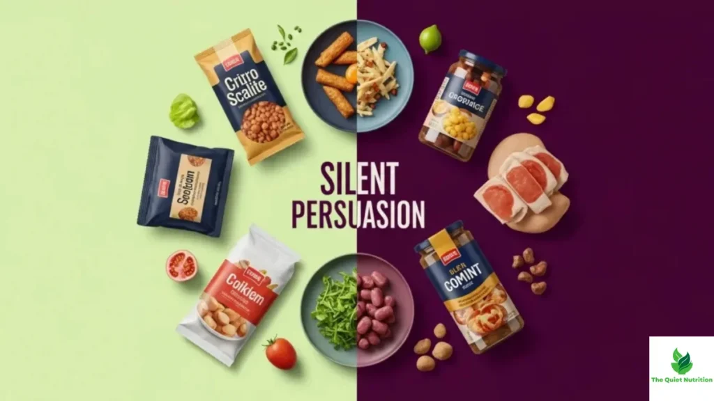
Long before you read a single word on a label, your brain has already formed an impression of a product — based purely on its shape, color, size, and how it sits on the shelf. This happens in a fraction of a second, well before conscious reasoning kicks in, which is exactly why packaging design is one of the most quietly effective forms of persuasion in the entire grocery store. It’s not about lying to you. It’s about shaping perception before you’ve even started thinking critically.
Shape Changes How Much You Think You’re Getting
One of the more counterintuitive findings in consumer research involves package shape and perceived volume. Studies on what’s known as the “elongation bias” have found that people consistently judge taller, narrower containers as holding more product than shorter, wider containers of the exact same volume. A tall, slim juice bottle feels like it contains more than a short, wide one holding the identical amount, simply because height is an easier visual cue for the brain to latch onto than overall volume.
This isn’t a trivial quirk — it directly affects purchasing decisions and satisfaction. Products in tall packaging are often perceived as a better value, and people tend to pour or serve less from tall, narrow containers than from short, wide ones, even when trying to portion out the same amount, because the visual cues around fullness are misleading in different ways depending on shape.
Color Sends a Message Before You Register It Consciously
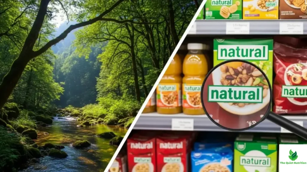
Color operates almost entirely below conscious awareness, yet it carries strong, culturally learned associations. Green consistently signals health, naturalness, and freshness, regardless of what’s actually inside the package, which is part of why so many products marketed as healthier options lean heavily on green packaging even when their nutritional content doesn’t particularly differ from competitors in different colored packaging.
Red and orange, by contrast, tend to stimulate appetite and convey energy or urgency, which is why they dominate fast food branding and snack packaging aimed at impulse purchases. Blue is comparatively rare in food packaging because it’s associated with appetite suppression and artificiality in most cultural contexts, an association strong enough that food manufacturers largely avoid it for products meant to look appetizing.
Package Size Quietly Sets Your Consumption Norm
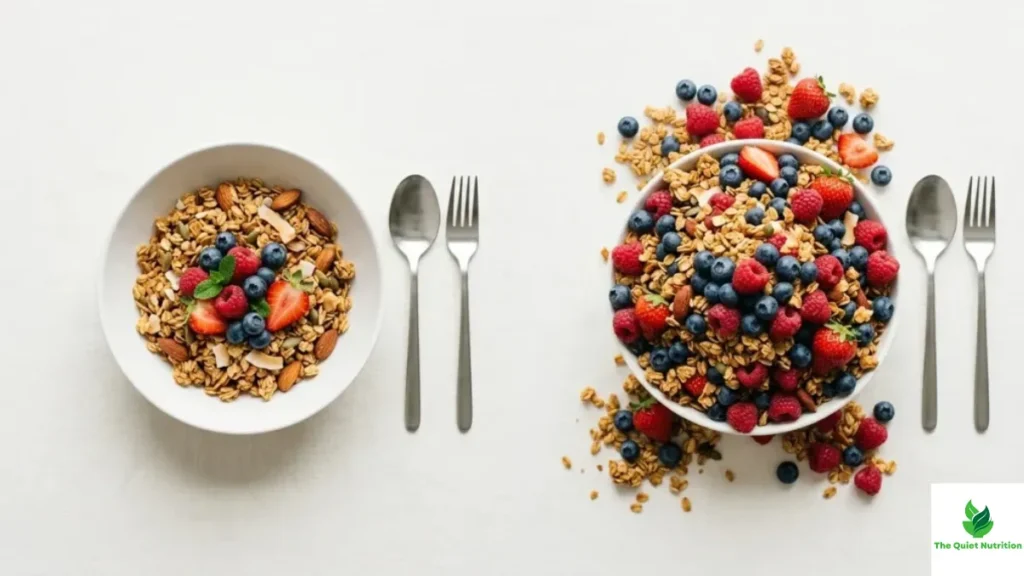
Package and portion size have a well-documented effect on how much people actually eat, independent of hunger. Research on portion sizing has repeatedly found that people consume more food when it’s presented in larger packaging or portions, even when they don’t report feeling hungrier or more satisfied afterward. The packaging itself functions as an implicit serving suggestion, subtly recalibrating what feels like a “normal” amount to consume in one sitting.
This effect compounds over repeated exposure. Someone regularly served or exposed to larger portions tends to gradually shift their internal sense of a normal portion size upward, meaning packaging doesn’t just affect a single meal — it can shape longer-term expectations about appropriate quantity.
Transparency and “See-Through” Windows Build Instant Trust
Packaging that includes a transparent window, letting the product itself be visible, taps into a fairly intuitive psychological cue: the ability to visually verify a product tends to increase trust and perceived quality, since it feels more honest than packaging that fully conceals its contents. This is part of why bakery items, produce, and premium snack products frequently use partial transparency, even when it offers no functional packaging benefit — it’s primarily a trust-building visual cue.
Weight and Texture Signal Quality Without a Word
Physical packaging characteristics beyond just visuals also shape perception. Heavier packaging materials, thicker glass, and matte finishes are consistently associated with higher perceived quality and premium positioning, a phenomenon well understood in product design more broadly, not just food. This is part of why premium or “artisanal” branded products frequently use heavier glass jars or thicker cardboard than mass-market equivalents carrying similar or even identical contents inside.
Characters and Imagery Target Specific Audiences Deliberately
Packaging featuring cartoon characters, mascots, or playful imagery is a well-studied strategy, particularly effective with children, who research shows are significantly more likely to prefer and request foods featuring familiar or appealing characters, regardless of the product’s actual nutritional content. This has drawn regulatory attention in several countries specifically because of how effectively character-based packaging shapes preference and purchase requests in young children who aren’t yet equipped to evaluate marketing critically.
Why Awareness Alone Helps
None of these design strategies are inherently deceptive — package design is a legitimate part of communicating a product’s identity, and plenty of packaging choices are aesthetic rather than manipulative. The issue is that many of these effects work below the threshold of conscious awareness, meaning even people who consider themselves savvy, skeptical shoppers are still influenced by shape, color, and size in measurable, well-documented ways.
Simply knowing these mechanisms exist tends to reduce their pull. Deliberately comparing products by their actual stated volume or serving size, rather than by how full or premium the packaging feels, is a small habit that can meaningfully counteract most of these visual shortcuts.
Sources
- Journal of Marketing Research – Effects of Package Shape on Volume Perception
- U.S. Food and Drug Administration – How to Understand and Use the Nutrition Facts Label
- World Health Organization – Food Marketing Exposure and Power: A Narrative Review
- Federal Trade Commission – Guides for the Use of Environmental and Health-Related Marketing Claims
- Harvard T.H. Chan School of Public Health – The Nutrition Source

Aarti Solanki, B.Sc. (Food Science), is a food science writer passionate about making nutrition simple and evidence-based. She creates well-researched, easy-to-understand articles on healthy eating, food science, and nutrition, using information from trusted scientific and public health sources.

Pingback: How “No Added Sugar” Can Still Mean Sweet — The Label Trick Most People Don’t Catch
Pingback: How Food Label Design Tricks the Brain Into Seeing “Healthy” — Even When It Isn’t
Pingback: How “Healthy” Food Claims Quietly Lead to Overeating