Two granola bars sit side by side on a shelf. One has a matte, earth-toned package with a leaf icon and the word “wholesome” in a soft serif font. The other has a bright, cartoonish wrapper with a cartoon character on it. Before you’ve read a single ingredient, your brain has already made a judgment call about which one is “better for you.” And here’s the unsettling part — that judgment often has almost nothing to do with what’s actually inside either wrapper.
This isn’t a personal failing or a lack of willpower. It’s a well-documented quirk of how human perception works, and food companies have gotten remarkably good at using it to their advantage.
The Shortcut Your Brain Can’t Help Taking
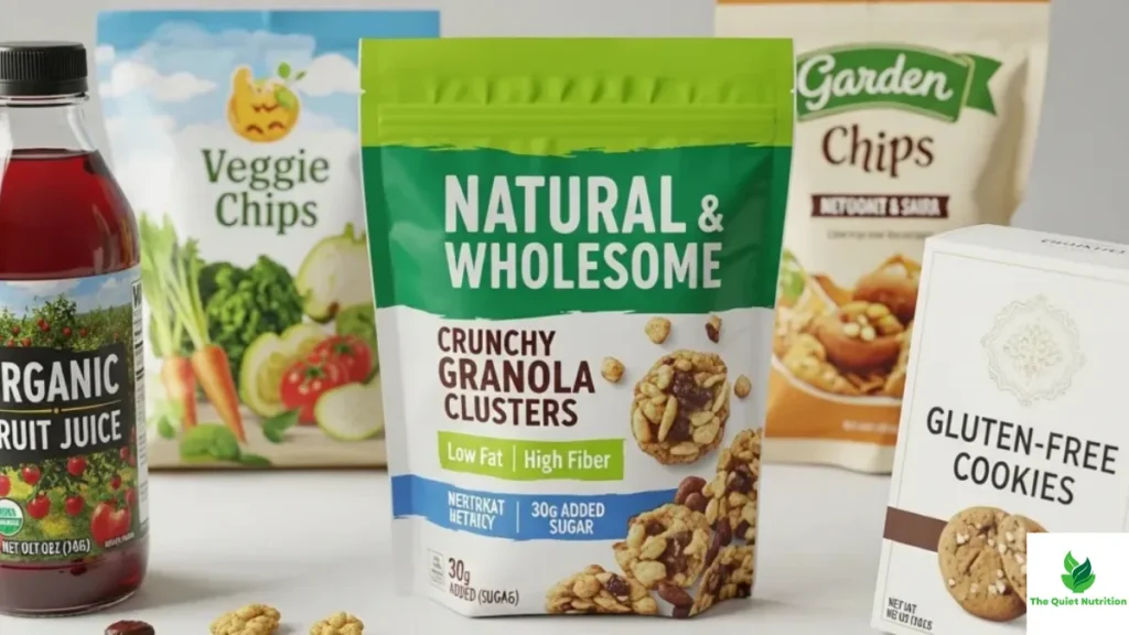
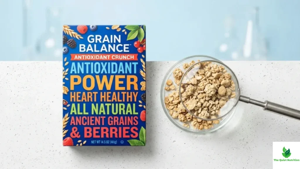
Nutrition scientists have a name for this: the health halo effect. It describes what happens when one appealing claim on a package — “low fat,” “organic,” “high protein” — causes people to assume the entire product is healthy, even when other parts of it clearly aren’t. Words and phrases that evoke wholesomeness, like “natural,” “rich in antioxidants,” or “good source of protein,” can create an instant sense of healthfulness in a shopper’s mind, even when the same product is loaded with salt, sugar, or heavily processed ingredients.
The reason this works so reliably comes down to how brains handle decisions. Standing in a grocery aisle, nobody has time to fully analyze the nutrition panel of every item they pick up. So the brain reaches for shortcuts — mental heuristics — that let it make a fast judgment based on limited information. A single positive-sounding claim becomes a stand-in for the entire product’s nutritional profile, letting shoppers skip the slower, more effortful step of actually reading the label.
It’s Not Just Words — It’s Color, Shape, and Texture Too
What makes this especially interesting is that the halo effect doesn’t only come from language. Visual design elements carry the same persuasive weight, often without shoppers realizing it’s happening at all.
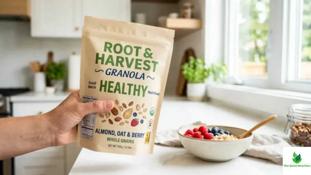
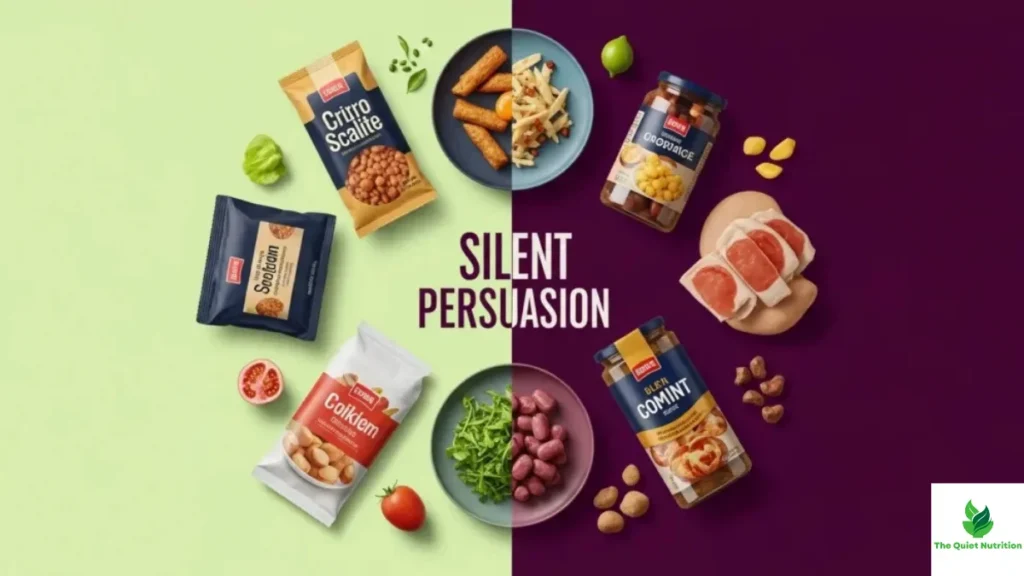
Packaging researchers have found that structural choices — the glossiness of the material, the shape of the container, even the softness of the color palette — shape how “healthy” or “indulgent” a product feels before a single word is read. A matte, earthy package signals restraint and nature. A glossy, saturated package signals sweetness and indulgence. Brands lean into this deliberately, because the visual cue does emotional work that a nutrition label never could.
Color research backs this up in a very specific way: lighter, softer product colors tend to be associated with lower calorie content in people’s minds, regardless of whether that association is actually true. A pale, pastel wrapper can make a product feel lighter and more virtuous than an identical product in bold, saturated packaging — even when both have the exact same nutrition facts.
The Claim Doesn’t Have to Be False to Be Misleading
Here’s the part that trips people up: a lot of these claims are technically accurate. That’s what makes the halo effect so effective — it isn’t built on lies, it’s built on selective emphasis.
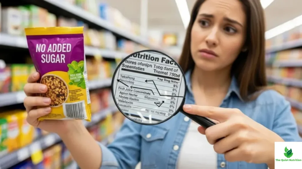
Take a “low fat” claim on a snack. It might be completely true, and the product might genuinely have reduced fat content. But that one true fact says nothing about the sugar that was added to compensate for the flavor lost when fat was removed, or the sodium added to preserve shelf life. The claim is honest. The impression it creates — that the whole product is a smart, healthy choice — often isn’t.
This selective spotlight effect shows up constantly with protein claims too. Research on protein bars found that highlighting protein content, whether through a claim on the package or simply by naming the product a “protein” bar, shifted how healthy people judged the entire product to be, independent of everything else on the label. The word “protein” did the persuading. The rest of the ingredient list did the actual explaining, and almost nobody read it.
Why “Reduced” and “Free-From” Labels Can Backfire in a Different Way
Interestingly, health claims don’t just distort how healthy something seems — they can distort how it tastes, at least in people’s expectations. Studies on packaging and flavor perception have found that claims about reduced salt or reduced fat and salt actually increased people’s perception of the product as healthy, while simultaneously lowering their expectations for taste and their actual reported enjoyment of it. In other words, the brain has quietly linked “healthy-sounding” with “less delicious,” which is its own kind of bias working in the opposite direction — one that can push people toward less healthy options simply because those feel more satisfying to eat.
Seeing the Trick Doesn’t Make You Immune, But It Helps
None of this means front-of-package design is inherently dishonest, or that every brand is deliberately manipulating shoppers. Plenty of companies use these cues simply because they work, without any deeper agenda than getting a product noticed on a crowded shelf. But understanding that your brain is wired to fall for a single glossy claim — regardless of intention — changes how you shop.
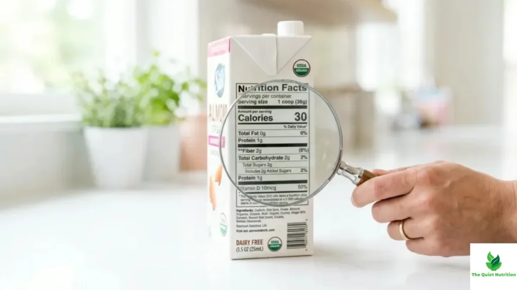
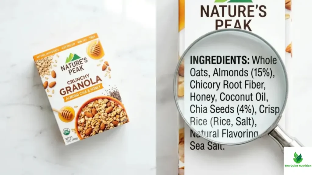
The practical fix isn’t complicated: treat the front of the package as advertising, because that’s exactly what it is, and treat the ingredient list and nutrition panel as the actual product description. One is designed to feel true in half a second. The other takes a little longer to read, but it’s the only part of the package that has to be.
Sources:
- Institute of Food Technologists — Gauging the Health Halo Effect
- PubMed — Health Halo Effects from Product Titles and Nutrient Content Claims in “Protein” Bars
- NCBI/PMC — How Visuals Affect Food Choice

Aarti Solanki, B.Sc. (Food Science), is a food science writer passionate about making nutrition simple and evidence-based. She creates well-researched, easy-to-understand articles on healthy eating, food science, and nutrition, using information from trusted scientific and public health sources.

Pingback: Why Clean-Looking Packaging Instantly Builds Trust — Even Before You Read the Label
Pingback: “Free From” Doesn’t Mean Healthy: The Truth Behind America’s Favorite Food Label