My sister once spent four dollars more on a jar of almond butter for reasons she couldn’t fully explain to me at the checkout line. Same brand family, same nutritional panel, practically identical ingredients to the cheaper jar sitting right next to it. The only real difference was the label — one wrapped in a busy, colorful design crowded with claims, the other minimal, matte, a single typeface, lots of white space. She picked the quiet one. When I asked why, she shrugged and said it “just felt more honest.” She hadn’t read either label closely enough to know if that was true.
That moment has stayed with me longer than it probably deserves to, mostly because it’s such a clean example of something food companies have understood for years and consumers almost never notice happening to them: trust, when it comes to food, is often decided visually, and it’s decided before a single word gets read.
The Brain Judges Fast, and Judges by Shortcuts
Psychologists have a term for this — the halo effect, first documented decades before it ever applied to grocery aisles. It describes the tendency for one positive impression, often something entirely superficial, to bleed into assumptions about unrelated qualities. A face judged attractive gets assumed more competent. A product that looks clean gets assumed to be clean, in every sense of the word, nutritionally and ethically, regardless of what’s actually inside.
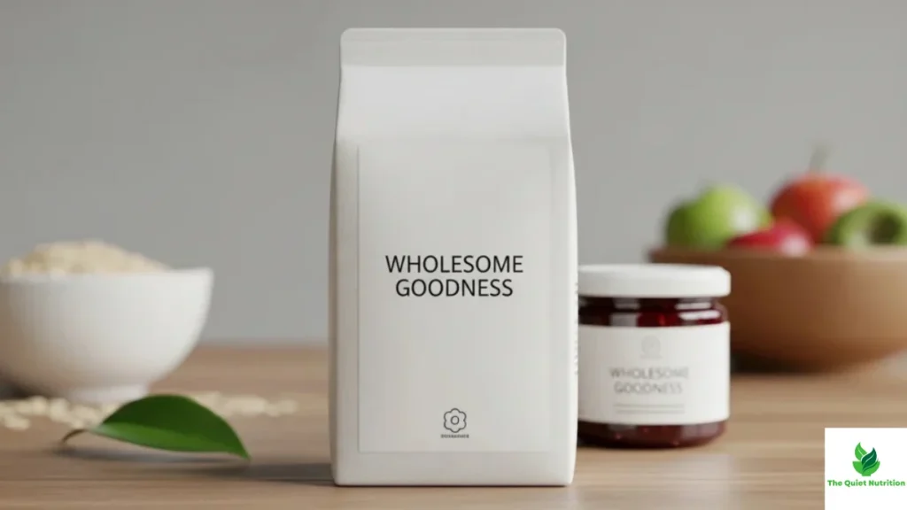
Minimalist packaging exploits this shortcut almost perfectly, whether the brand behind it is being deliberately deceptive or genuinely believes in what it’s selling. White space reads as simplicity. Simplicity reads as purity. Purity, in the mind of someone scanning a shelf in eleven seconds — which is roughly the average time researchers have clocked for a typical grocery decision — reads as healthy. None of that chain of association requires reading a single ingredient. It happens faster than conscious evaluation even starts.
Color Is Doing More Work Than Anyone Admits
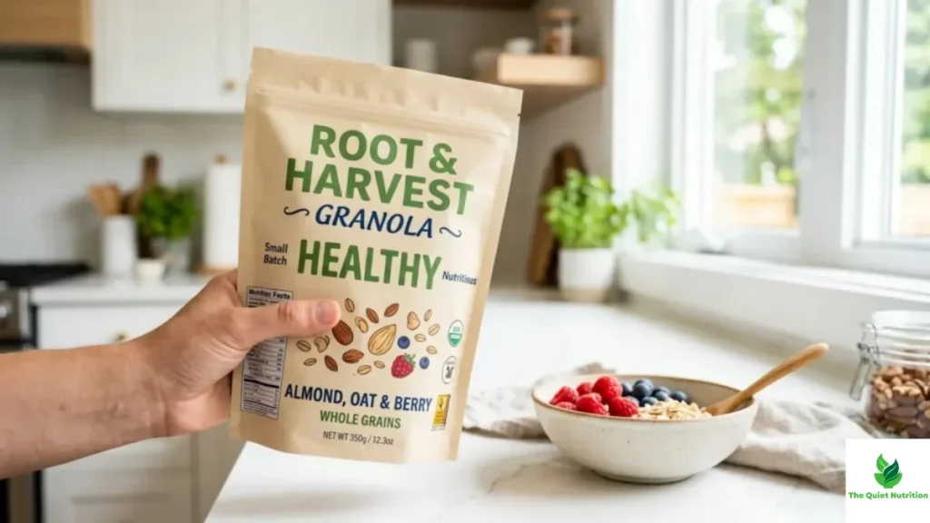
There’s a reason so much of the “clean eating” aesthetic has converged on the same narrow palette — muted greens, kraft-paper browns, soft off-whites, the occasional sage. Color psychology research consistently finds that green is associated with nature, health, and freshness across most Western markets, largely because of its long association with plants and the outdoors. Brands didn’t discover this by accident. They tested it, extensively, and converged on a visual language that now functions almost like a universal shorthand for “this is good for you,” independent of whether the product backs that impression up nutritionally.
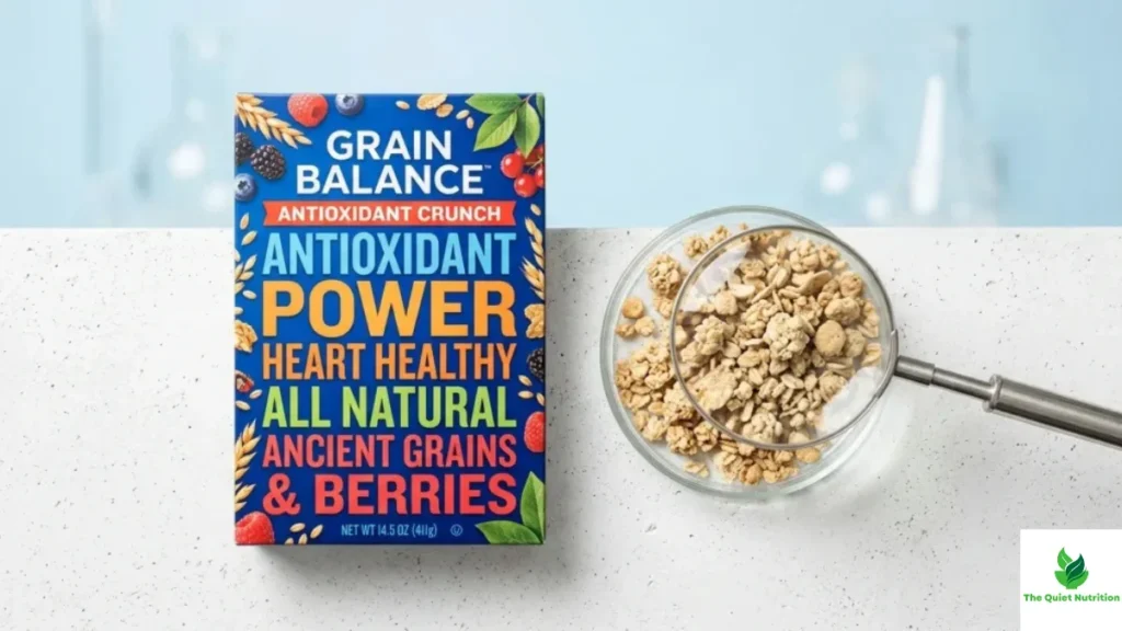
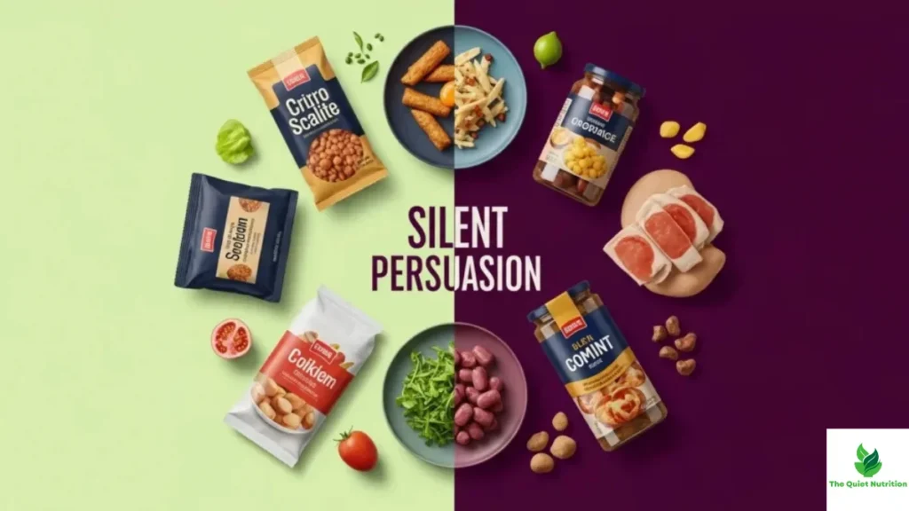
Compare that to the loud, saturated packaging typical of processed snack foods — reds, yellows, high-contrast graphics designed to grab attention on a crowded shelf. That palette isn’t accidental either. It’s optimized for a completely different goal: visibility and appetite stimulation, not trust. Red and yellow are well documented to increase perceived urgency and hunger, which is precisely why so much fast food branding leans on that combination. Neither palette is describing the product’s actual nutritional content. Both are describing a psychological effect the product wants to trigger.
Simplicity Signals Honesty, Even When It’s Strategic
There’s a specific design principle at work called “processing fluency” — the idea that things which are easier to visually process get judged, almost automatically, as more trustworthy and higher quality. A label with one clean font, a short ingredient list visible on the front, and generous white space is easier to process than one crammed with certifications, bold claims, and competing colors. That ease gets misattributed to the product itself. The packaging feels honest because it was easy, not necessarily because the contents earned that trust.
This is where the almond butter moment gets genuinely interesting. The quieter jar my sister chose wasn’t lying to her, exactly. But the feeling of honesty she experienced was manufactured every bit as deliberately as the louder jar’s shouting was. One brand used volume to compete for attention. The other used restraint to compete for trust. Both were making a calculated bet about how the human eye assigns meaning before the human brain gets a say.
What This Actually Means at the Shelf
None of this is an argument that minimalist packaging is inherently deceptive, or that every quiet, kraft-paper label is hiding something. Plenty of genuinely high-quality products use restrained design because restraint fits the brand honestly. The point is narrower and, frankly, more useful: the feeling of trust that clean packaging generates arrives before any actual evidence does, and that gap is exactly where marketing intends to operate.
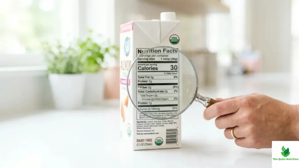
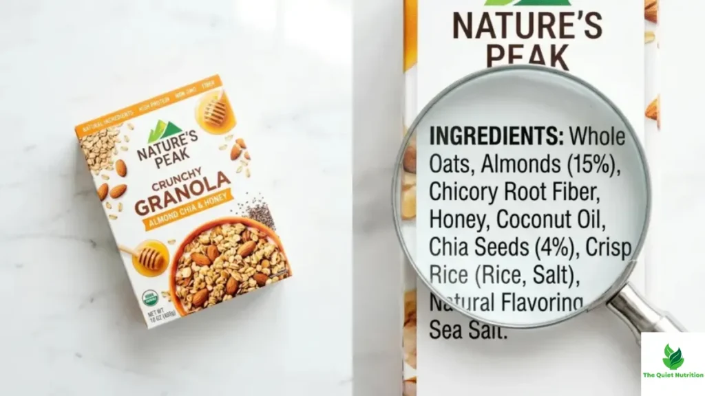
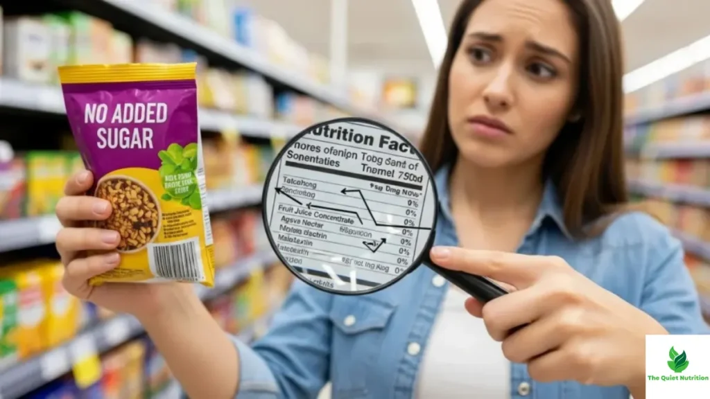
The only real defense is a small, unglamorous habit — flipping the product over anyway, regardless of how honest the front looks, and letting the ingredient list do the job the packaging was designed to skip. It’s not as satisfying as trusting your gut in the checkout aisle. But your gut, it turns out, was reacting to typography and color theory long before it got anywhere near the actual food.
Sources:
- Journal of Consumer Research — Studies on Packaging and Health Perception: https://academic.oup.com/jcr
- American Psychological Association — The Halo Effect: https://www.apa.org/topics/cognitive-bias
- Harvard T.H. Chan School of Public Health — Nutrition Source: https://www.hsph.harvard.edu/nutritionsource/
- U.S. Food and Drug Administration — Food Labeling Guide: https://www.fda.gov/food/food-labeling-nutrition
- Cornell Food and Brand Lab — Packaging and Consumer Perception Research: https://www.brandlab.cornell.edu/

Aarti Solanki, B.Sc. (Food Science), is a food science writer passionate about making nutrition simple and evidence-based. She creates well-researched, easy-to-understand articles on healthy eating, food science, and nutrition, using information from trusted scientific and public health sources.