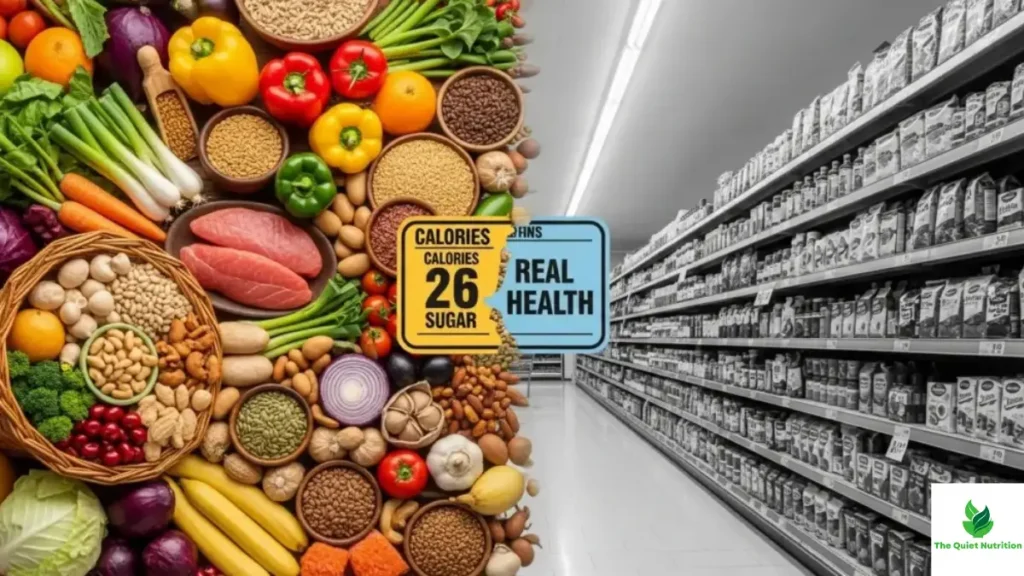
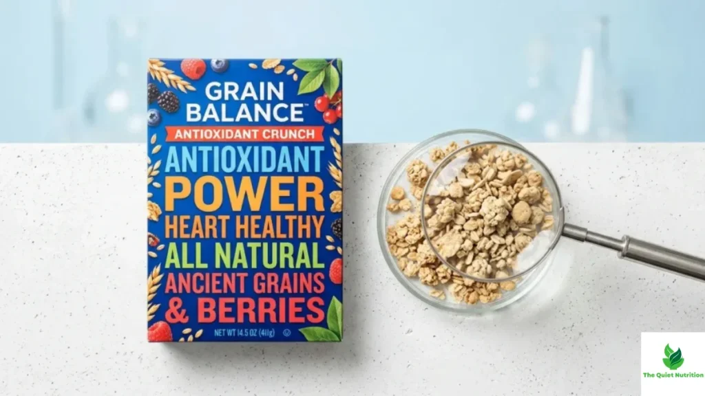
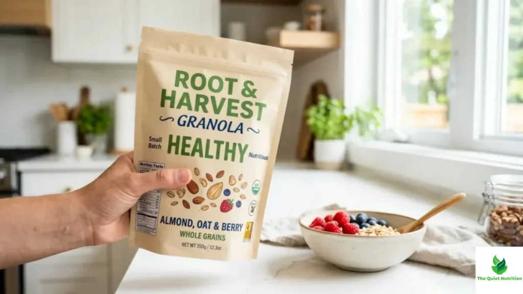
A dietitian friend of mine keeps two cereal boxes on her office shelf, not as decoration but as a teaching tool. Side by side, their nutrition panels look almost identical — similar calories, similar fat, similar sugar down to the gram. Clients assume they’re nutritionally interchangeable within about four seconds of looking at them. Then she flips both boxes around and reads the ingredient lists out loud, and the room usually goes quiet. One is built from whole grains and a short list of recognizable things. The other is a cascade of refined starches, gums, and additives engineered to hit those same numbers on the front panel. Same score. Completely different food.
She uses this demonstration because it captures something the entire nutrition label system was never actually designed to communicate: numbers can match perfectly while quality diverges completely, and most people have been trained to stop looking the moment the numbers check out.
The Label Was Built to Answer a Narrower Question Than People Think
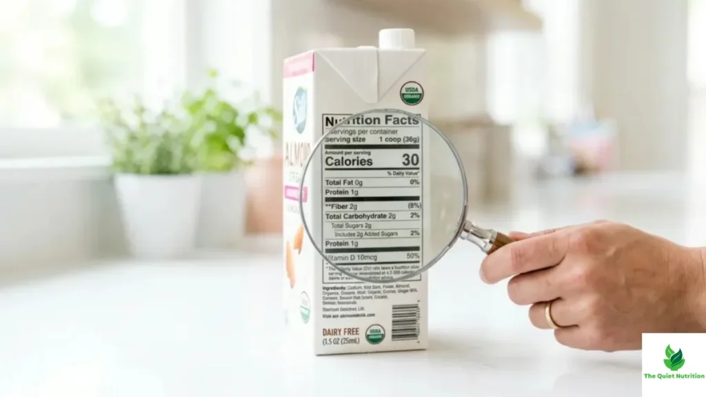
Nutrition labels, in their current form, emerged largely from a public health push in the early 1990s aimed at combating specific, measurable problems — excess fat, excess sodium, excess calories in an obesity-rising population. That’s a reasonable goal, and the label does that narrow job reasonably well. What it was never built to do is answer the more complicated question people actually bring to it now: is this food good for me, not just within some acceptable numerical range.
Grams of sugar, for instance, don’t distinguish between sugar naturally present in fruit, bound up with fiber and slowly absorbed, and sugar added during processing, hitting the bloodstream fast with nothing to slow it down. The label treats both identically because chemically, at the molecular level, sucrose is sucrose. Physiologically, in the body, the context surrounding that sugar changes almost everything about how it behaves. A label built around isolated numbers simply isn’t equipped to carry that kind of nuance, and it was never claiming to.
Where the Real Information Is Hiding
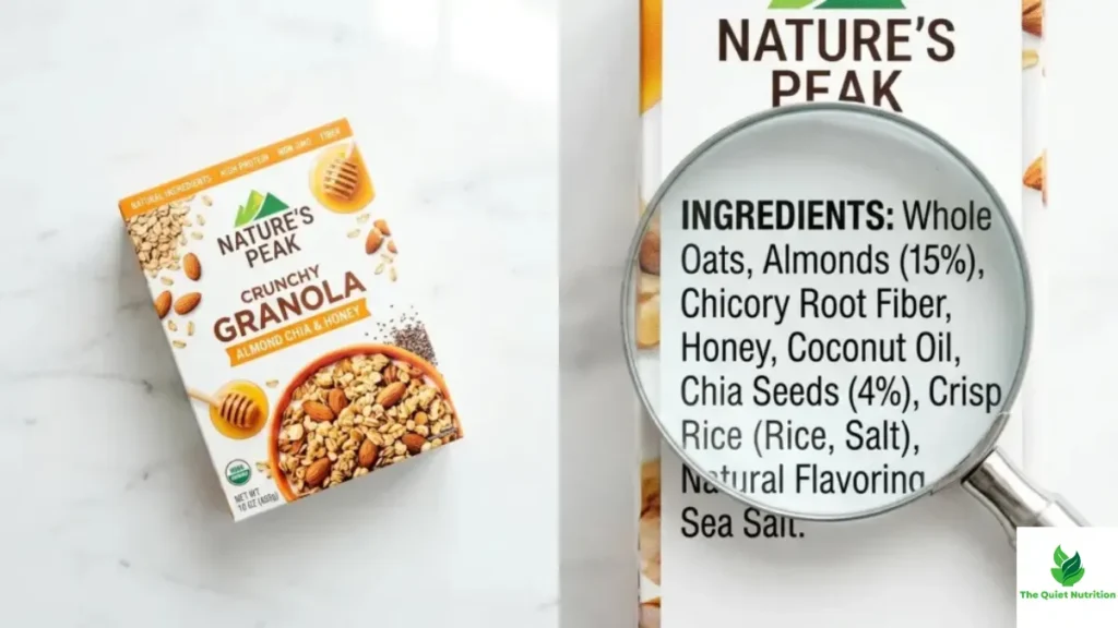
The ingredient list, tucked below the panel most people never bother reading past the first three lines, is quietly where the more honest story lives. Ingredients are listed by weight, in descending order, which means the first three or four items make up the overwhelming bulk of the product. A cereal listing whole wheat first is telling a different story than one listing corn syrup, then sugar, then a modified starch before any actual grain shows up. The nutrition panel above it can look nearly identical on both.
This is also where processing becomes visible in a way calories and macros can’t capture. A long list of unrecognizable, multi-syllable additives — emulsifiers, stabilizers, artificial preservatives — often signals a level of industrial processing that’s increasingly linked, in emerging research, to metabolic and inflammatory outcomes independent of the calorie or macro content those additives were added to. The label’s front panel has no mechanism for expressing “this food went through eleven processing steps.” The ingredient list, read carefully, does.
Serving Sizes Are Doing Quiet, Deceptive Work
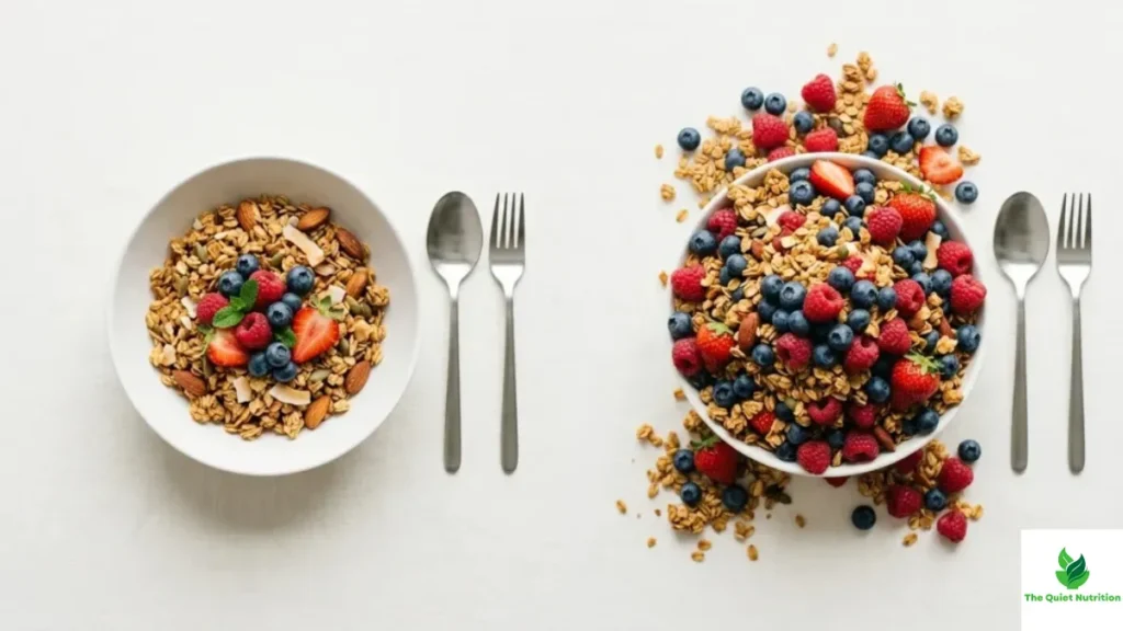
Serving sizes deserve their own scrutiny, because they’re frequently set at portions nobody actually eats. A bag of chips listing 150 calories per serving, with “about 2.5 servings per container,” is technically accurate and functionally misleading for anyone who, reasonably, eats the bag. This isn’t illegal or even against labeling regulations — it’s simply a loophole built into how the system works, and it means the number on the front of the package is often describing a fictional portion size rather than the real one sitting in someone’s hand.
Nutrient Density Is the Missing Variable
Perhaps the biggest blind spot in standard labeling is nutrient density — how much actual nutritional value a food delivers per calorie, beyond the handful of nutrients required to be listed. A food can meet every numerical target on the front panel while being nearly devoid of the micronutrients, phytochemicals, and fiber diversity that matter for long-term health, simply because those things were never required disclosures in the first place. Two “low-fat, low-sugar” products can differ enormously in what they’re actually contributing to the body, and the label has no column for that difference.
Reading Past the Front of the Box
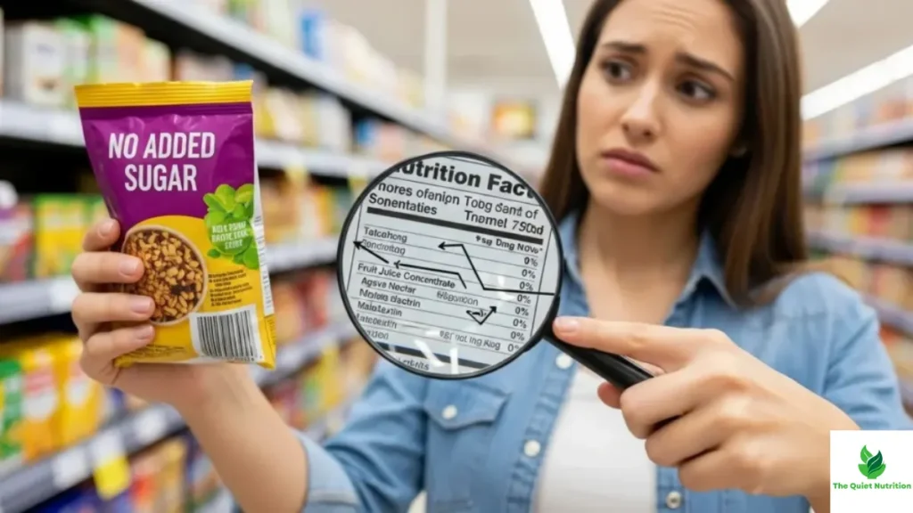
None of this means nutrition labels are useless — they remain a genuinely useful, standardized starting point, especially for people managing specific conditions like diabetes or hypertension where individual numbers matter directly. But treating the front panel as the whole story, the way most shopping decisions currently get made, skips the parts of the story that actually determine whether a food is doing something good for the body or just technically clearing a numerical bar.
My dietitian friend’s two cereal boxes still sit on that shelf, identical on paper, worlds apart in practice. It’s a small, deliberately staged demonstration. But it captures, better than any single statistic could, the gap between what a label is required to say and what a body actually experiences once the food is eaten.
Sources:
- U.S. Food and Drug Administration — Food Labeling Guide: https://www.fda.gov/food/food-labeling-nutrition
- Harvard T.H. Chan School of Public Health — Nutrition Source: https://www.hsph.harvard.edu/nutritionsource/
- National Institutes of Health — Ultra-Processed Foods and Health Research: https://www.ncbi.nlm.nih.gov/pmc/
- World Health Organization — Healthy Diet Fact Sheet: https://www.who.int/news-room/fact-sheets/detail/healthy-diet
- Cornell Food and Brand Lab — Consumer Perception and Labeling Research: https://www.brandlab.cornell.edu/

Aarti Solanki, B.Sc. (Food Science), is a food science writer passionate about making nutrition simple and evidence-based. She creates well-researched, easy-to-understand articles on healthy eating, food science, and nutrition, using information from trusted scientific and public health sources.

Pingback: Why Nutrition Panels Don’t Tell the Whole Truth — And What Food Labels Leave Out
Pingback: Why “Zero” Claims on Food Labels Can Be Misleading — And What They Don’t Tell You