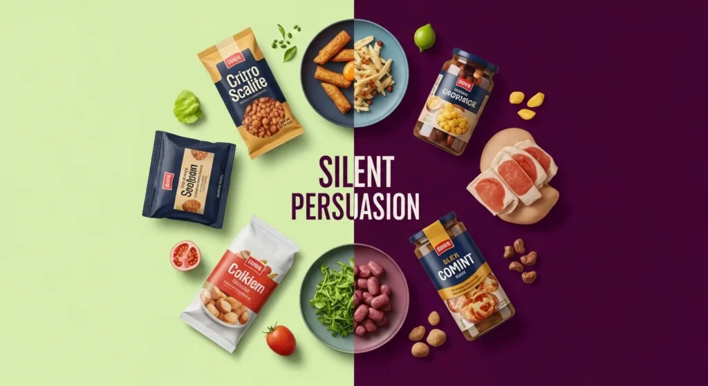
The Confusing Moment Everyone Has Had
You’re standing in a grocery aisle.
Two foods look almost identical.
Same category.
Same flavor.
Same purpose.
Yet when you flip them over, the nutrition labels tell two very different stories.
One looks clean and “healthy.”
The other looks heavy, sugary, or high-calorie.
Your brain pauses.
“How can this be?”
“Am I missing something?”
“Which one is actually better?”
That confusion is intentional—but not in the way most people think.
Nutrition labels don’t just reflect food.
They reflect rules, strategies, and technical decisions that hide crucial context.
Let’s break down exactly why similar foods look so different on labels—and how to read past the illusion.
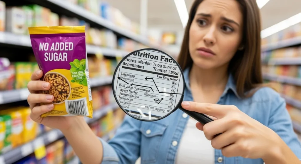
Nutrition Labels Are Legal Documents, Not Food Truths
Nutrition panels are built to meet regulatory requirements, not to explain food clearly.
They follow strict formulas that prioritize:
- Standardization
- Compliance
- Quantifiable metrics
They do not prioritize:
- Real-world eating behavior
- Biological response
- Food quality or processing level
This is why two similar foods can look drastically different on paper—even when they behave similarly in your body.
Serving Size: The Biggest Source of Label Differences
Serving size is the number one reason similar foods look different.
Manufacturers are allowed to define serving sizes within broad guidelines.
What This Creates
- Smaller serving = fewer calories
- Smaller serving = lower sugar
- Smaller serving = lower sodium
Two products may contain the same amount of food per package—but one reports it as:
- 1 serving
- 2 servings
- 2.5 servings
Real-Life Example
- Granola A: ½ cup per serving
- Granola B: ⅓ cup per serving
Granola B looks “lighter,” but most people pour the same bowl size.
The food didn’t change.
The math did.
Ingredient Concentration Changes the Numbers
Two similar foods can use different forms of the same ingredient.
This dramatically affects labels.
Example: Fruit-Flavored Yogurt
- Yogurt A uses whole fruit purée
- Yogurt B uses fruit juice concentrate
Both are “fruit-based,” but juice concentrate:
- Adds more sugar
- Lacks fiber
- Impacts blood sugar differently
The label reflects sugar grams—but hides how that sugar behaves.
Water Content Quietly Skews Everything
Water is invisible on nutrition labels—but it changes everything.
Foods with higher water content show:
- Fewer calories
- Lower sugar concentration
- Lower fat per serving
Example
- Thick yogurt vs thinner yogurt
- Dense bread vs airy bread
Same weight? Maybe.
Same eating experience? No.
One is diluted.
One is concentrated.
Labels don’t explain this difference.
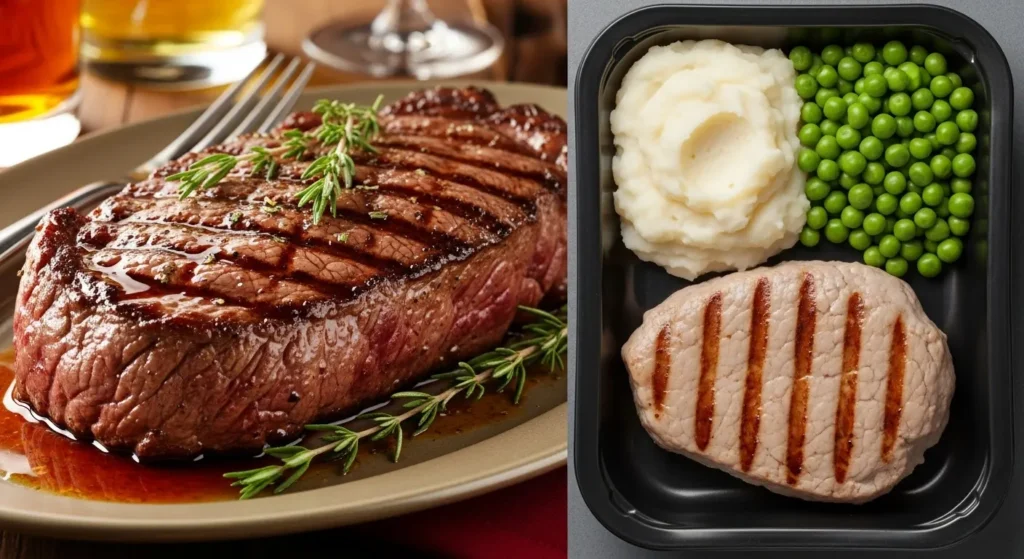
Processing Level Is Completely Hidden
Nutrition labels cannot show how processed a food is.
This is a massive blind spot.
Two similar foods may share macros, yet differ in:
- Industrial refinement
- Ingredient modification
- Structural integrity
Why This Matters
Highly processed foods digest faster, spike hunger sooner, and feel less satisfying—despite similar numbers.
Labels don’t capture:
- Speed of digestion
- Satiety response
- Food structure loss
Your body notices.
The label doesn’t.
Fortification Creates False Comparisons
Some foods look more nutritious simply because nutrients were added back artificially.
This skews comparisons.
Example
- Cereal A naturally contains nutrients
- Cereal B is stripped, then fortified
Cereal B’s label may look “better,” but fortification doesn’t restore:
- Food structure
- Absorption efficiency
- Natural nutrient balance
The label rewards numbers—not nourishment.
Rounding Rules Quietly Change Reality
Labels are allowed to round numbers down.
This creates meaningful differences over time.
Common Rounding Effects
- Sugars under 0.5g can show as 0g
- Calories under 5 can show as 0
- Fats under 0.5g can disappear
One food uses rounding aggressively.
Another reports exact values.
Over multiple servings, those “zeros” add up.
Comparison Table: Why Similar Foods Look Different on Labels
| Factor | What You See on Labels | What’s Actually Different |
|---|---|---|
| Serving size | Lower calories | Smaller portion math |
| Sugar grams | Big difference | Sugar form & concentration |
| Fat content | Appears lighter | Water dilution |
| Protein | Same grams | Different quality |
| Fiber | Similar numbers | Natural vs added fiber |
| Vitamins | Higher %DV | Artificial fortification |
| Calories | Lower total | Faster digestion |
| Sodium | Reduced | Serving manipulation |
Why This Matters Today
Modern food shelves are crowded with near-identical options.
When labels conflict, people:
- Feel overwhelmed
- Lose trust in food choices
- Chase numbers instead of nourishment
Understanding why labels differ restores clarity.
You stop asking:
“Which number is better?”
And start asking:
“What’s actually different here?”
That shift changes everything.
Common Mistakes People Make When Comparing Labels
Avoid these traps:
- Comparing foods without checking serving sizes
- Assuming lower calories means better quality
- Ignoring ingredient order
- Trusting fortification over whole ingredients
- Comparing processed and whole foods as equals
These mistakes aren’t ignorance—they’re design outcomes.
How to Compare Similar Foods Smarter (Actionable Steps)
1. Standardize the Serving Size
Compare per 100g or per cup—not per labeled serving.
2. Read Ingredients Before Numbers
Ingredients explain why numbers differ.
3. Look for Water-Heavy Formulas
Lower calories may signal dilution, not superiority.
4. Treat Fortification as Neutral
Added nutrients don’t equal whole-food quality.
5. Ask the Processing Question
“How many steps did this food go through?”
Hidden Tip: When Labels Matter Most
Labels work best when comparing nearly identical processing levels.
Compare:
- Two yogurts
- Two breads
- Two snacks
Avoid comparing:
- Whole foods vs ultra-processed foods
That’s where confusion starts.
Key Takeaways
- Similar foods look different due to math, not magic
- Serving size is the biggest distortion
- Processing level is invisible on labels
- Fortification skews comparisons
- Smarter reading reduces confusion instantly
Once you see the pattern, labels lose their power to mislead.
Frequently Asked Questions
1. Are nutrition labels inaccurate?
No—but they’re incomplete by design.
2. Why do “healthier” foods sometimes look worse?
Because they’re more honest—or less diluted.
3. Should I trust ingredients more than numbers?
Yes. Ingredients explain context.
4. Do lower calories always mean better?
Not if they come from water or processing tricks.
5. What’s the fastest way to compare foods?
Standardize serving size and scan ingredients first.
Conclusion: Labels Explain Numbers, Not Food
Nutrition labels aren’t lying.
They’re just not telling the whole story.
Once you understand why similar foods look different on labels, confusion turns into confidence—and comparison becomes clarity.
You stop chasing “better numbers”
and start choosing better food.
Disclaimer: This article is for general educational purposes only and does not replace personalized nutrition or medical advice.