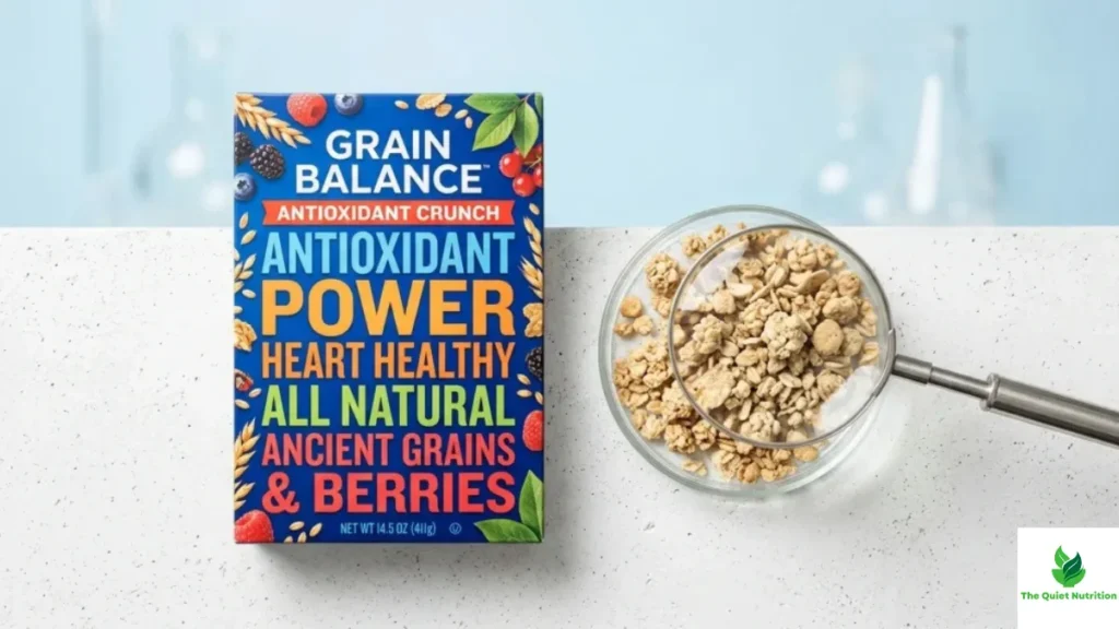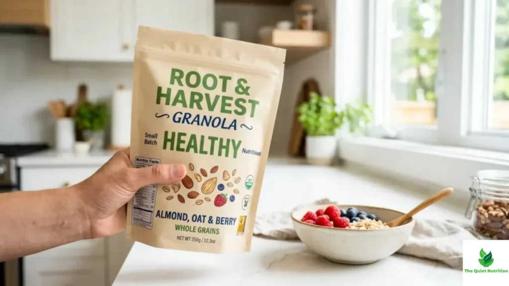
My neighbor runs a small bakery, the kind with flour dust permanently ground into the floorboards, and she once vented to me about a supplier meeting that left her rattled. She’d been asked to reformulate her whole wheat loaf — not to change the recipe meaningfully, but to change how it was measured and presented, so it could compete on shelf with a mass-produced “artisan” loaf sitting one row over. Same category. Roughly the same core ingredients. And yet, she said, the two loaves might as well have been describing entirely different foods by the time their labels were finished being optimized.
That conversation has rattled around in my head since, mostly because it points at something shoppers rarely get access to: two products that are nutritionally close cousins can be presented as though they belong to completely different worlds, and the presentation gap has almost nothing to do with the actual food.
Serving Size Is the First Sleight of Hand
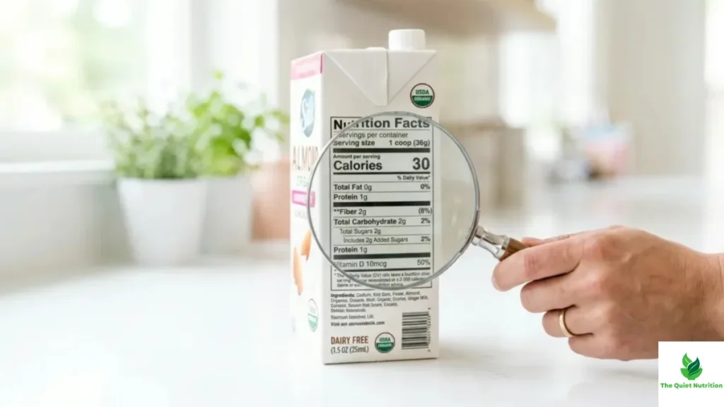
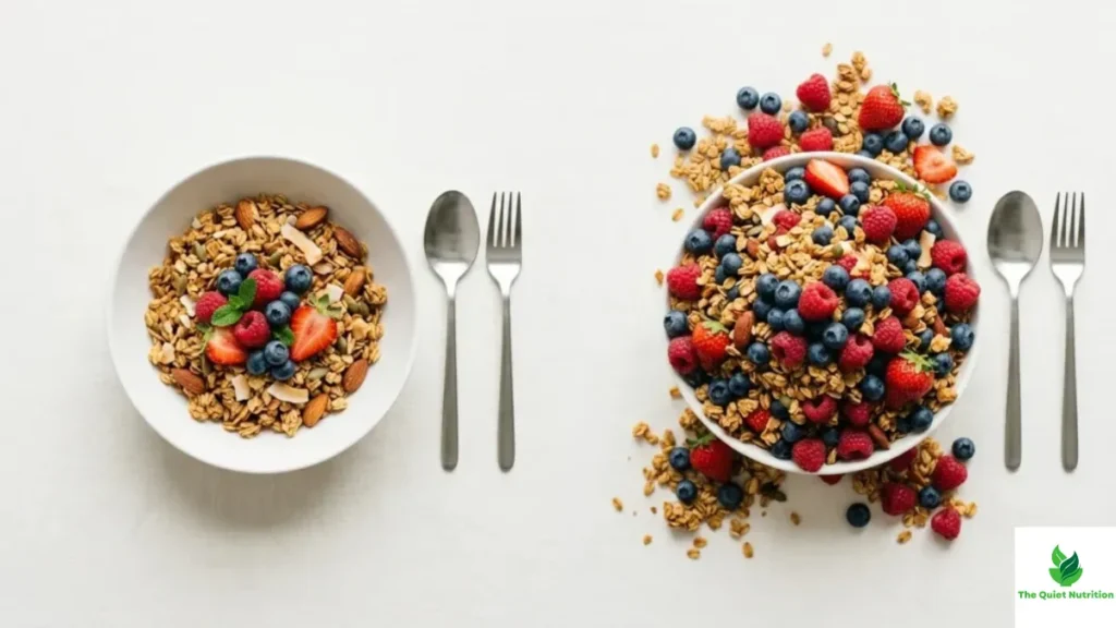
The most common reason two similar foods look wildly different on paper is the simplest and least discussed: serving sizes aren’t standardized the way people assume. Two brands of granola can use different serving definitions — one calling out a third of a cup, another calling out a half cup — and every number on the panel shifts accordingly, even if the underlying formulation per gram is nearly identical. A shopper glancing at “8 grams of sugar” next to “14 grams of sugar” reads that as a meaningful nutritional difference. Often it’s simply a difference in how much food each brand decided to call “one serving.”
This isn’t universally deceptive — some serving size variation reflects genuine differences in how a product is typically eaten. But it’s exploited often enough that comparing two products by their per-serving numbers alone, without checking whether those servings actually match, produces conclusions that have little to do with the food itself.
Rounding Rules Create Real Divergence From Nearly Identical Recipes
Labeling regulations allow rounding within defined thresholds — a gram of fat can round down to zero under certain conditions, a handful of calories can round away entirely. Two products with genuinely similar recipes can land on opposite sides of those rounding thresholds purely by chance, or by a formulation tweaked by half a gram specifically to cross a threshold that matters for marketing. A product nudged just under the line for “low fat” gets to carry that label prominently. A nearly identical competitor sitting a fraction of a gram over the line doesn’t, despite the actual nutritional difference between them being close to meaningless in practice.
This is closer to what my neighbor was describing. Her loaf and the competing one weren’t nutritionally distant. They were positioned on opposite sides of thresholds that exist mostly for labeling purposes, thresholds that reward precise formulation-to-the-gram over any genuine difference in what a person eating the bread actually experiences.
Fortification Turns Similar Foods Into Different Stories
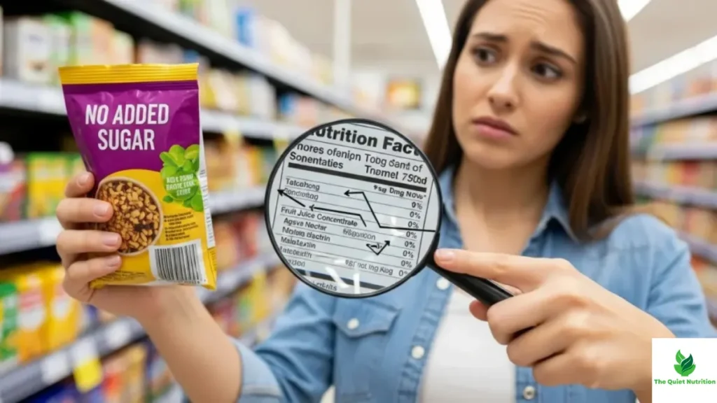
Vitamin and mineral fortification is another quiet lever. Two breads made from comparable flour can diverge sharply once one is fortified with added iron, folate, or B vitamins and the other isn’t, even though fortification says little about the quality of the base ingredients. Fortified products get to claim a longer list of nutritional benefits on the front panel, creating an impression of superiority that isn’t really about the bread itself so much as about a handful of nutrients sprayed or mixed in afterward, often cheaply, specifically because fortification claims perform well with health-conscious shoppers.
None of this means fortification is bad — in some public health contexts, like folate fortification and neural tube defect prevention, it’s been genuinely valuable. But at the shelf level, it creates a visual and nutritional gap between similar foods that has more to do with an added-ingredient decision than any deeper difference in the food’s fundamental quality.
Ingredient Sourcing Rarely Shows Up on the Panel at All
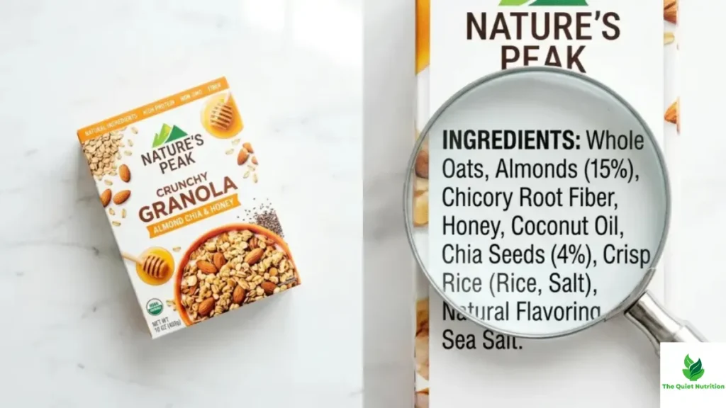
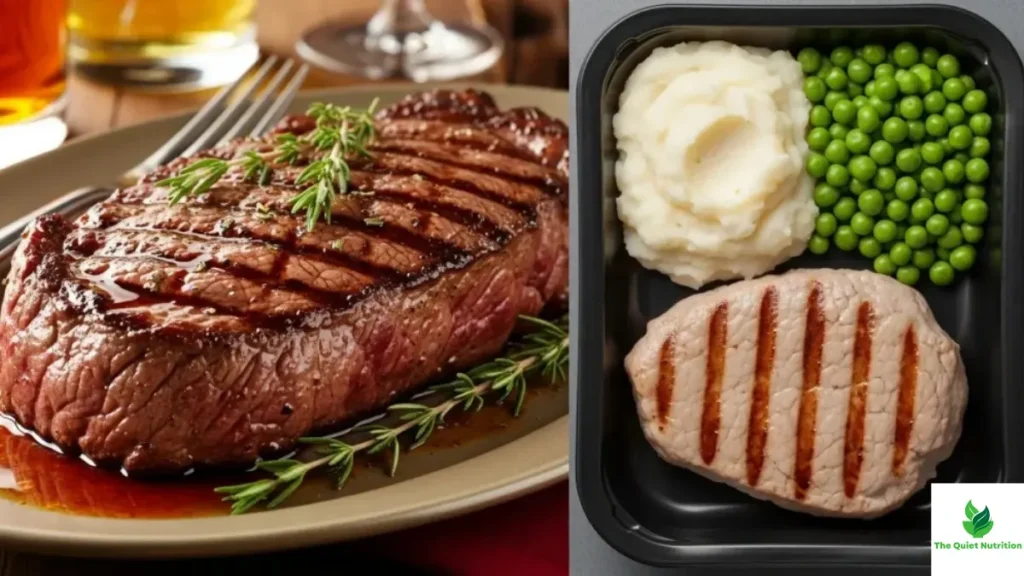
Perhaps the widest, least visible gap between similar-looking foods involves sourcing and processing methods that never appear on a nutrition panel because they’re simply not required disclosures. Two loaves of “whole wheat” bread can use flour processed through very different milling methods, with correspondingly different retention of the grain’s natural nutrients and fiber structure, and both can carry the identical “100% whole wheat” claim because that claim is regulated by ingredient category, not by processing method. The panel captures grams of fiber. It says nothing about how that fiber got there, or what was stripped away and partially added back in through fortification to reach that number.
What My Neighbor Ended Up Doing
She didn’t reformulate her loaf, in the end. She kept the recipe the same and instead started printing a short note on the label explaining her flour source and milling process, information nutrition regulations never required but that told a truer story than the panel numbers alone ever could. It didn’t help her compete on the metrics the supplier had been pushing. It did, she said, attract exactly the customers who were going to bother reading past the first few grams anyway.
That’s roughly the lesson buried in all of this. Two similar foods diverging sharply on their labels usually isn’t revealing a real difference in quality. It’s revealing which side of a rounding threshold, a serving size definition, or a fortification decision each product happened to land on — details that shape the label dramatically while leaving the actual food, more often than shoppers assume, close to where it started.
Sources:
- U.S. Food and Drug Administration — Food Labeling Guide: https://www.fda.gov/food/food-labeling-nutrition
- Harvard T.H. Chan School of Public Health — Nutrition Source: https://www.hsph.harvard.edu/nutritionsource/
- World Health Organization — Healthy Diet Fact Sheet: https://www.who.int/news-room/fact-sheets/detail/healthy-diet
- Cornell Food and Brand Lab — Consumer Perception and Labeling Research: https://www.brandlab.cornell.edu/
- Mayo Clinic — Understanding Food Labels: https://www.mayoclinic.org/healthy-lifestyle/nutrition-and-healthy-eating

Aarti Solanki, B.Sc. (Food Science), is a food science writer passionate about making nutrition simple and evidence-based. She creates well-researched, easy-to-understand articles on healthy eating, food science, and nutrition, using information from trusted scientific and public health sources.