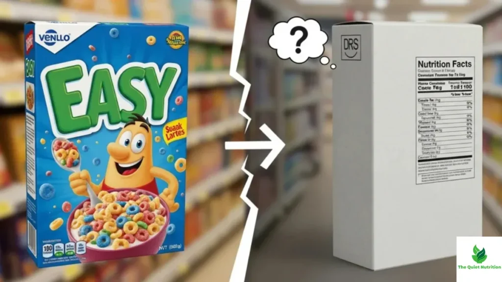
A single letter, a single color, a single star rating. Across grocery stores in dozens of countries, that’s what nutrition has been boiled down to on the front of packaging — Nutri-Score’s green A through red E, the UK’s red-yellow-green traffic lights, Australia’s health star system. The whole appeal is speed: glance at a symbol, know instantly whether something’s a good choice. It’s a genuinely useful idea. It’s also, by design, a massive compression of something far more complicated than a single grade can capture.
The Simplification Is the Whole Point — And Also the Whole Problem
These systems exist because nutrition information used to be too dense for most people to use quickly. A full nutrition panel with a dozen numbers, percentages, and reference values takes real effort to interpret in the middle of a grocery run. Front-of-pack labels solve that by collapsing all of it into one glance-able signal.
The tradeoff is baked into the design itself. Research comparing consumer reactions across five major label formats — health star ratings, traffic lights, Nutri-Score, reference intakes, and warning labels — found that people generally liked color-coded, interpretive formats and understood them quickly. But the same research flagged a real cost: oversimplified formats risk excluding information that people actually want, and that exclusion can make the label feel less trustworthy the more someone thinks about it. Simplicity buys speed. It spends detail to get there.
A Good Score Can Still Mean a Processed Product
One of the sharpest criticisms of these systems is what they leave out entirely: how processed a food is. Nutri-Score, for example, is built around nutrient content — sugar, saturated fat, sodium, fiber, protein, fruit and vegetable content — but it doesn’t directly factor in the degree of processing a food went through to get there. That means a product can score favorably based on its nutrient profile while still qualifying as ultra-processed, potentially containing additives and manufacturing characteristics that other research has linked to worse health outcomes independent of the nutrients on the label.
This isn’t a hypothetical gap. It’s significant enough that the researchers who developed Nutri-Score have publicly acknowledged it and are actively exploring revisions, including a proposed visual marker specifically flagging ultra-processed foods regardless of their underlying nutrient score. That a labeling system’s own creators are working to patch this hole tells you the gap is real, not just a talking point from critics.
Some Genuinely Healthy Foods Get Penalized by the Math
There’s a second recurring criticism, and it’s almost the opposite problem: foods that are broadly considered healthy within long-standing dietary traditions sometimes score poorly because of how the algorithm weighs individual components. Olive oil and cheese are commonly cited examples — both are staples of dietary patterns linked to strong health outcomes, yet both can receive unfavorable ratings under scoring systems that weigh fat and saturated fat content heavily, without fully accounting for the broader context in which those foods are typically consumed.
This exposes something important about any single-score system: reducing a food to one letter or color requires picking a formula, and any formula built from population-level averages will inevitably misjudge some foods that don’t fit the general pattern it was designed around. The algorithm isn’t lying. It’s just applying one generalized model to foods that don’t always behave the way the model assumes.
They Also Use Per-100g Values, Not How Much You’d Actually Eat
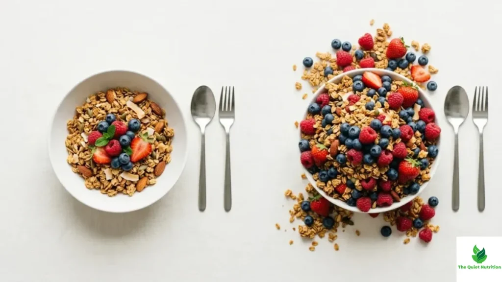
Another structural quirk: most of these systems calculate their score based on a standardized 100-gram or 100-milliliter amount, not a typical serving size. That means two products with identical scores can represent very different real-world portions, and a food eaten in small amounts gets judged by the same yardstick as a food eaten by the bowlful. It’s a reasonable way to keep comparisons consistent across products, but it can quietly distort how the score maps onto someone’s actual eating habits.
They’re Still Genuinely Useful — Just Not the Whole Answer
None of these limitations mean front-of-pack labels are failing at their job. The evidence on their real-world effect is fairly encouraging. Large randomized trials testing Nutri-Score against other formats found it was the most effective at helping consumers correctly rank foods by nutritional quality across a dozen countries, and follow-up research found that shopping carts exposed to Nutri-Score contained a meaningfully higher proportion of unprocessed foods and fewer ultra-processed purchases compared to carts with no label at all. A workplace cafeteria trial in France found measurable improvements in the nutritional quality of food choices after the label was introduced.
So the honest picture is two things being true at once: these labels do nudge people toward better choices, and they still miss real dimensions of food quality that matter — processing level, food tradition and context, and how much of something a person actually eats. A green label is a useful starting signal. It was never built to be the final word.
What This Means When You’re Standing in the Aisle
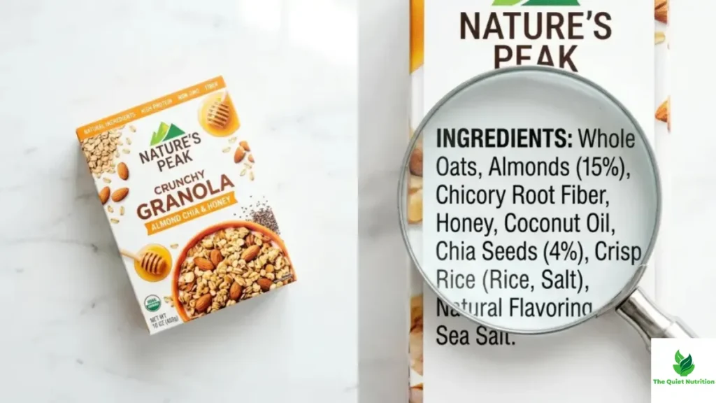
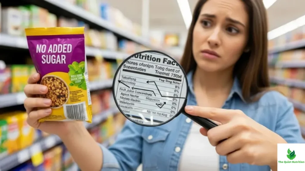
A front-of-pack score is worth glancing at — it genuinely correlates with better average choices. But treating it as a complete verdict skips over exactly the details these systems were built to compress away. If a product’s score seems surprisingly good or surprisingly bad, that’s often a sign worth investigating a little further, not dismissing. The ingredient list and the degree of processing still carry information no single letter grade was ever designed to hold.
Sources:
- Food Frontiers (Wiley) — A Systematic Assessment of the Revised Nutri-Score Algorithm
- NCBI/PMC — Consumers’ Perceptions of Five Front-of-Package Nutrition Labels: A 12-Country Study
- NCBI/PMC — Objective Understanding of the Nutri-Score Front-of-Pack Label and Its Effect on Food Choices
- NCBI/PMC — Impact of the Nutri-Score on Purchasing Intentions of Unprocessed and Processed Foods

Aarti Solanki, B.Sc. (Food Science), is a food science writer passionate about making nutrition simple and evidence-based. She creates well-researched, easy-to-understand articles on healthy eating, food science, and nutrition, using information from trusted scientific and public health sources.

Pingback: Why Clean-Looking Packaging Instantly Builds Trust — Even Before You Read the Label
Pingback: “Free From” Doesn’t Mean Healthy: Why Food Labels Obsess Over What’s Missing Instead of What Matters